Graphic Methods. Under Composition and Resolution of Forces it has been noticed that the point of application, the direction, and the intensity of any force may be represented by the end, direction, and length of a straight line. Similarly, any other physical quantity, such as temperature, atmospheric pressure, or barometric height, electric potential, &c., may be represented by straight lines. Such modes of showing the value of a quantity are called graphic methods; they are largely employed in physical investigations as aids to calculation, and for the purpose of exhibiting the nature of the law according to which some phenomena vary. The principal use of this method is to show the mutual variations of two quantities. This we will illustrate by a particular example.
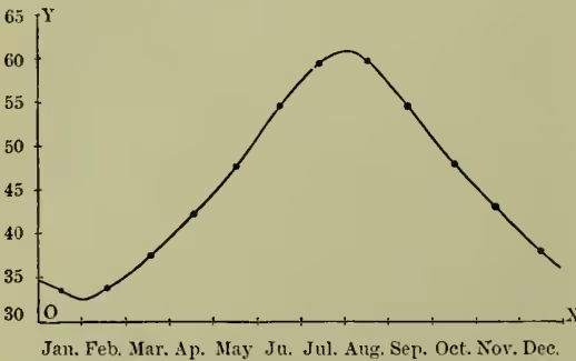
Suppose a table is drawn up, in one column of which are the months of the year, and in the other the corresponding average temperatures of the air, at some particular place, during these months (the average temperature for each month being the mean of the daily temperatures). Let two lines, OX and OY, be drawn from O, one horizontally, the other vertically; let the successive months of the year be represented on any convenient scale along OX, and let temperature be measured along OY, also on a convenient scale. Corresponding to each month in the year there will be a length along OX, and to each temperature there will correspond a point on OY. At the middle point corresponding to each month draw perpendicular to OX a line representing the temperature on the scale of OY. A series of lines will thus be obtained, through the upper ends of which there may be drawn, freehand, a smooth curve. The points on the curve in the figure represent the upper ends of these lines. A general glance at such a curve will reveal certain features regarding the temperature of the whole year; at what dates maxima and minima occurred; when the temperature rose or fell quickest, and so on. Such a curve, representing the gradual change of daily temperature, may be produced automatically by photographic representation: a sheet of sensitised paper passes uniformly, by means of clockwork, behind the thermometer stem, in front of which is placed a source of light; the paper above the mercury column is blackened, that below being left unaffected; the curve separating the black and white portions represents the temperature at different times. The same principle is used in the thermograph, barograph, and tide-gauge recording machine.
Instead of time and temperature any other two variable quantities may be taken. When the curve obtained by such graphical methods has some regular geometrical features the mathematical law of the phenomenon may be found; and many qualitative and quantitative results in physics are obtained in this way. It must be remembered that such graphical representations do no more than embody the results of observation or experiment, and cannot be made more accurate than the data themselves.
The graphic method is so largely employed in physical science, and also in statistics, that only a few instances of its application may be given. Watt's Indicator Diagram shows the amount of work done in a complete (double) stroke of the piston; it acts on the principle that the force applied multiplied by the distance through which it acts is a measure of the work done. Pressure and volume are therefore the variables here involved. The temperature of a body at different times may be given by a curve, from which may be found the rate of cooling; a curve may also represent the temperature at different points of a body, and from it may be deduced, if its thermal conductivity be known, the flux of heat across any section of it. The thermo-electric diagram (see Tait's Heat) is also a valuable application of the method. Andrew's diagram of the volume of carbonic acid gas under varying pressure may be mentioned as another (see Andrew's Collected Scientific Papers, Lond., Macmillan, 1889). The method has also many applications in electricity—e.g. the 'arrival' curve in a submarine cable; and in sound, where acoustic vibrations, beats, and harmonics may be graphically represented.